

What spot and process color actually mean
A spot color uses a separately specified, premixed ink. Process color builds an image from cyan, magenta, yellow and black (CMYK). Adobe describes spot inks as useful for critical colors and colors outside the process gamut, while process colors suit photographs and complex illustrations. Its explanation concerns commercial printing; it does not establish which decoration method a particular wooden-box supplier can deliver. Adobe’s guide to spot and process colors provides the basic distinction.
Keep the color approach separate from the application method. “CMYK” does not tell your supplier whether the design should be applied directly to a coated panel or through another agreed decoration route. Likewise, “spot color” does not automatically specify screen printing. If your project calls for a screened logo, use the separate guide to screen printing on finished wooden boxes to discuss that process.
The quotation should name both the artwork treatment and the proposed production route. Ask the supplier to mark any substitution before sampling.
Choose by artwork requirement, not by the number of visible colors
| Artwork requirement | Starting point to discuss | What to approve |
|---|---|---|
| A defined brand mark or a few flat graphic areas | Separate spot ink, or an explicitly accepted process simulation | The critical color on the agreed finished surface |
| A shaded botanical, photograph or landscape | Process reproduction of the multicolor image | Detail, tonal transitions and the overall color balance |
| Illustration plus a tightly controlled brand color | A combined specification, subject to supplier capability | Both the illustration and the separately identified critical area |
| A reflective gold detail beside printed artwork | A separately specified decorative effect | Its physical appearance, location and relationship to the printed colors |
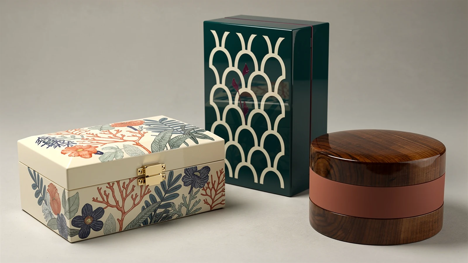
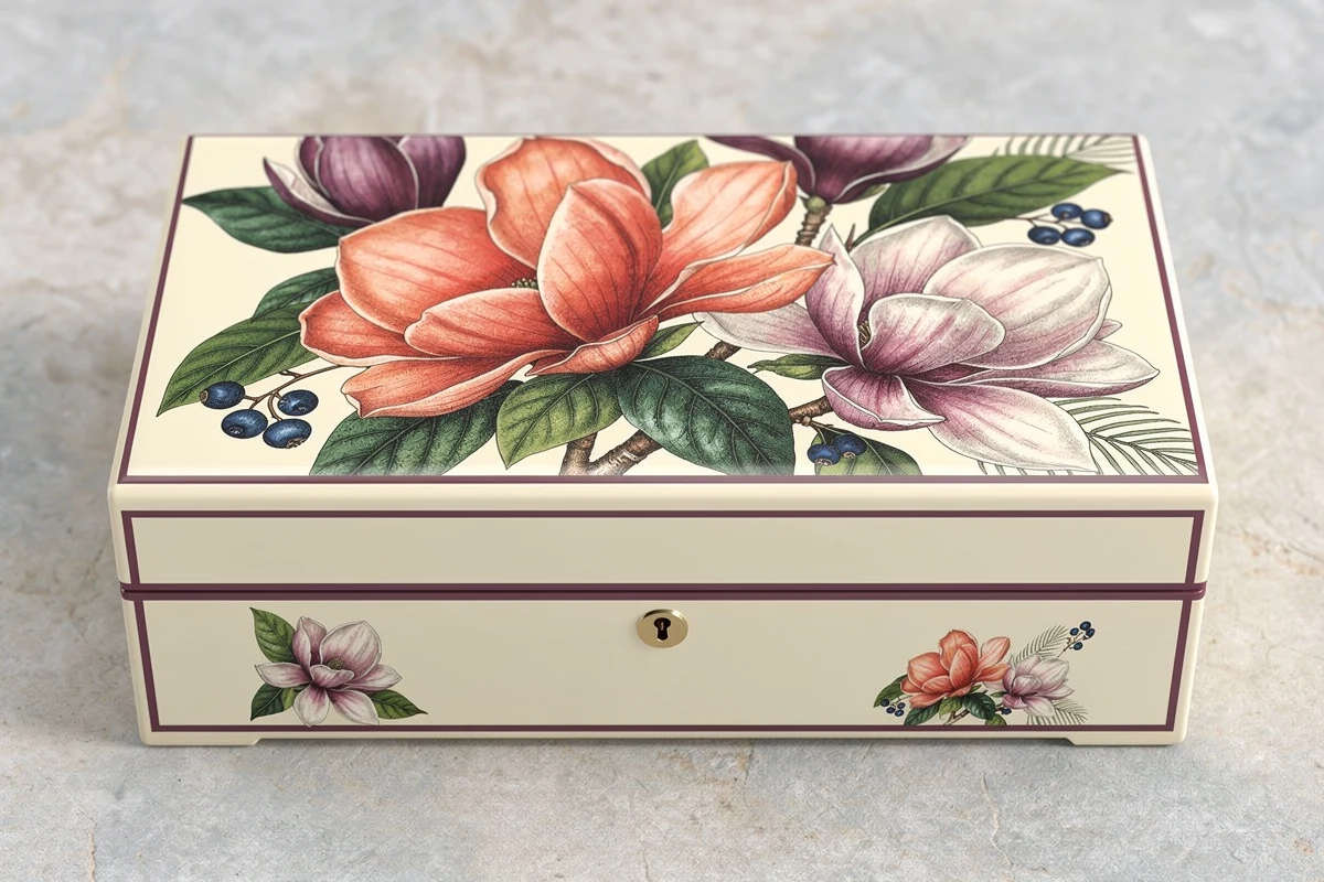
A floral design with many visible hues does not necessarily require a separate ink for every hue. Conversely, a design with only a few visible colors still needs a clear output specification. Use the table to frame the discussion, rather than treating it as a production prescription.
Separate flat gold-colored artwork from a requested reflective effect in the brief. Mark which areas merely need a warm gold tone and which require a separately approved material or decoration. A reference photograph may show the desired appearance, but ask the supplier to explain how the proposed sample will achieve it.
A named spot swatch does not guarantee a separate ink
The file and the output can diverge. Adobe Illustrator includes an option that converts spot colors into process separations. A named spot swatch can therefore remain part of the design discussion without being produced as a separate ink in the final workflow. Adobe’s color-separation instructions document that conversion explicitly.
Before approving the file, ask the production partner for a short output confirmation:
- Which named colors will remain separate inks, and which will be simulated?
- What process ink set and output profile or printing condition will be used?
- Are white, coating or other special channels included, and what does each one mean?
- Does the supplied proof represent the proposed output, or only the artwork layout?
Have the printer check separations and overprint behavior in the production file. A buyer does not need to operate the prepress software, but should retain the confirmation with the approved artwork revision. A design screenshot alone does not establish which inks the supplier will use.
Avoid converting files repeatedly between teams. Assign responsibility for the production conversion, and keep an unchanged copy of the approved source artwork. If a supplier proposes an alternative color build, approve that alternative explicitly instead of leaving two conflicting specifications in circulation.
Define the surface behind the color
Color approval needs a defined printing condition. The International Color Consortium describes that condition in terms of the printing system, substrate and inks, and explains proofing as a simulation of the intended result. It also notes that a swatch book’s substrate may differ from the print job. ICC’s graphic-arts color-management paper supports that distinction; it is not a wooden-box performance test.
For procurement, apply this principle by recording the proposed surface build. State whether the artwork sits over an opaque colored ground or a visible wood-grain surface. Identify any proposed white base and whether a clear finish will cover the decoration. Ask the supplier to confirm the sequence and compatibility for the actual materials.
Do not approve the box simply as “walnut color with printing.” That description leaves the background appearance, printed area and finishing sequence unresolved. A better approval record identifies the sample, artwork revision, decorated faces, surface treatment and final sheen together.
If two product variants use different grounds, list them as separate approval items. One accepted illustration on an ivory ground should not silently become the reference for the same illustration over dark visible grain. Decide whether each variant must match a common target or may have its own approved appearance.
Map the design onto the assembled box
A flat artwork approval leaves several practical questions unanswered. Which panel is the front? Does a border continue across the opening seam? Where does a clasp obscure the illustration? Should the inside of an open door carry the same graphic as the outside?
Mark these decisions on the panel drawing before sampling. For each decorated face, provide its orientation, artwork version, intended coverage and reference edges. Identify deliberate blank areas around hardware and openings. Ask the supplier to propose achievable placement tolerances rather than inserting an unsupported universal value into the purchase order.
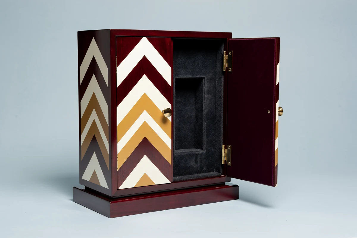
Review the closed and open box separately. A geometric design can look orderly when closed yet leave an unintended fragment on the inside edge when opened. Specify whether continuity is essential or whether each panel has an independent composition. Mark the intended result on both the closed-box and open-box drawings so the sample can be checked against the same instruction.
Approve a reference that answers the actual question
Use each review stage for a defined purpose. The following sequence is a proposed purchasing workflow, not a claim about tests already performed by XRX:
- Artwork review: confirm text, orientation, panel mapping, named colors and the agreed output plan. Record the file revision.
- Color and surface review: examine a representative decorated surface made with the proposed material and finish sequence. Record what this sample does and does not represent.
- Assembled-box review: inspect the final appearance, seams, hardware clearances and decorated faces together. Identify the retained approval sample.
A paper proof can help review artwork and color intent. Do not treat it as approval of the wooden box’s texture, gloss, construction or decoration placement. Similarly, photographs are useful for communication but should not replace an agreed physical reference when surface appearance is a purchasing requirement.
If numerical color limits are required, agree the reference, measurement method, locations and acceptance rule with the supplier. This article does not prescribe a universal color-difference limit for every ink, wood surface and finish. Keep visual acceptance requirements explicit even when a measurement report is requested.
For the broader handover from sample to production, use the golden sample approval checklist. For this printing decision, attach the artwork revision and output confirmation to that record.
Put these fields into the quotation request
Send a compact brief that allows the supplier to identify unresolved choices before quoting:
- Box drawing, order quantity and decorated faces.
- Artwork files and revision, with critical colors marked separately from illustrative colors.
- Requested spot inks, accepted process simulations and any separately specified decorative effects.
- Proposed base appearance, visible grain or opaque ground, white base if relevant, and final finish.
- Panel orientation, coverage, hardware exclusions and continuity requirements.
- Required proof or sample stages, approval reference and responsibility for final file conversion.
Request separate identification of setup, sampling and production charges where applicable. Do not assume that CMYK is always cheaper or that a short spot-color list always costs less: compare quotations for the same artwork, quantity, coverage and approved construction. Ask which proposed changes would require a new proof or sample.
For a project with XRX, send the artwork and intended surface appearance alongside the wooden packaging box requirements. You can contact the team to review the proposed decoration route and sampling scope before fixing the production specification.
Frequently asked questions
Is spot color better than CMYK for wooden boxes?
Neither is better for every design. Discuss spot inks for defined critical colors and process reproduction for multicolor imagery. Choose against the artwork, proposed production route and approved finished sample.
Can one design use both spot and process colors?
Yes. A design can combine a process illustration with a separately specified spot color. Confirm that the supplier can produce the combination and identify each area clearly in the artwork and output instructions.
Does a Pantone name in a PDF mean a separate ink will be used?
No. A named color may be converted or simulated during output. Ask the supplier to confirm which colors remain separate inks and which use process reproduction before approving the production file.
Is a paper proof enough to approve printing on a finished wooden box?
A paper proof can support artwork and color-intent review, but it does not approve the box’s surface, sheen or decoration placement. Agree a representative finished sample for those requirements and record its scope.
What should trigger another printing approval?
List approval triggers in the order documentation, such as changes to artwork, critical color treatment, decorated surface, finish sequence or production route. Assess the affected requirement before accepting a revised proof or sample.